A Picture is Worth A Thousand Words - Or Is It?
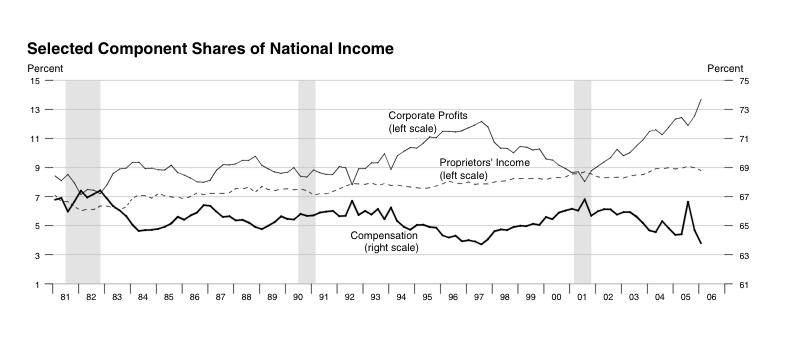
This graph of Selected Component Shares of National Income, showing corporate profits compared to compensation, speaks very loudly; only I'm not sure what it's saying, other than that corporations are increasing profits at a fast clip. (Source)

[Click on image for larger version. Thanks to St. Louis Fed.]
How can corporations show so much profit and not have the increase show up in a correspondingly robust GDP increase? I wish the science of economics could interpret these figures with some accuracy; but unfortunately, we're not there yet.
posted by Katy Delay at 5:18 PM
![]()
![]()


0 Comments:
Post a Comment
<< Home